User Interface Design for Paul Mitchell The School's now defunct "Future Professionals" app.

Overview
Paul Mitchell Schools’ needed a proprietary digital learning ecosystem: a centralized education and resource tool that connected Future Professionals (students) to the Paul Mitchell network of learning systems, including The Color System, The Cutting System, and The Makeup System.
As a UI Designer on the team, I was responsible for helping modernize the app’s visual identity and user experience across a suite of modular, system specific learning tools. My focus was on creating an intuitive and aesthetically unified interface that could bridge complex technical education (cutting, coloring, styling) with accessible, mobile first digital learning
Design Objectives
- Unify Multiple Systems under one app through consistent visual language and navigation.
- Modernize the Learning Experience with interactive flashcards, color maps, and digital headsheets.
- Increase Retention & Accessibility through improved hierarchy and legibility.
The Challenge
Paul Mitchell needed a way to translate decades of hands on educational expertise into an interactive format for students learning both in person and remotely.
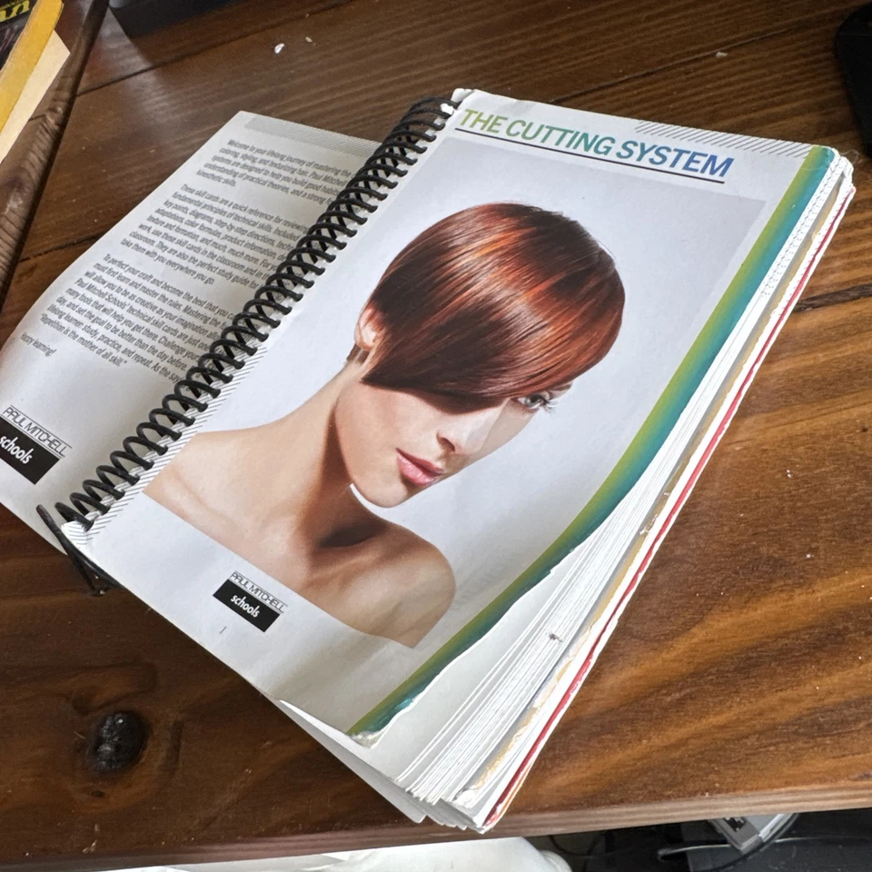
The legacy experience was static and inconsistent. Each “System” (Cutting, Color, Makeup) had its own design style, creating friction for users transitioning between tools. The goal was to design a cohesive digital environment where learners could seamlessly navigate, engage with HD video tutorials, complete digital workbooks, and visualize haircutting diagrams in an intuitive and tactile way.
.webp)
.webp)
.webp)
Key Screens
Splash & Login Screens
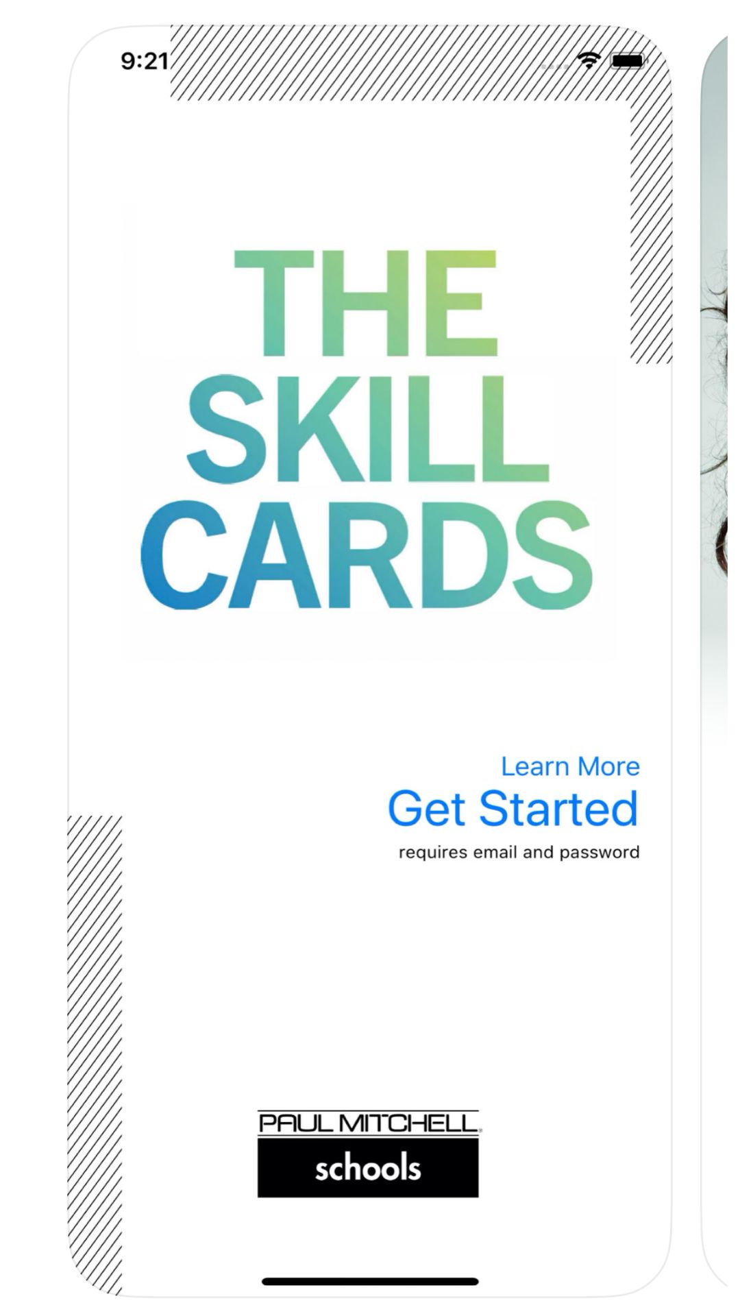
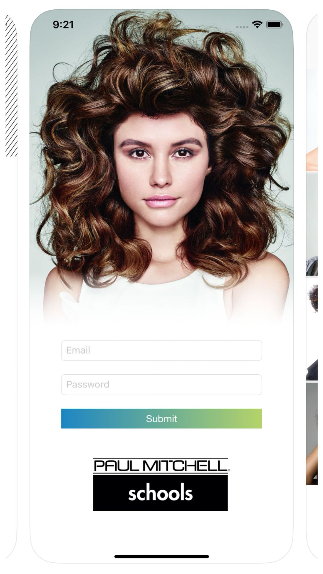
The splash and login screens set the tone for the Future Professionals experience. The design was playful, fun, and unmistakably Paul Mitchell. Designed with a minimalist aesthetic inspired by the brand’s identity, these entry screens immediately established joy and professionalism while emphasizing accessibility. The splash screen introduced the signature Paul Mitchell logo and tagline against a sleek white backdrop, while the login flow featured clear input fields and lightweight typography optimized for mobile and tablet readability. Together, they created a polished first impression that reinforced the brand’s premium, industry leading image.
System Menu
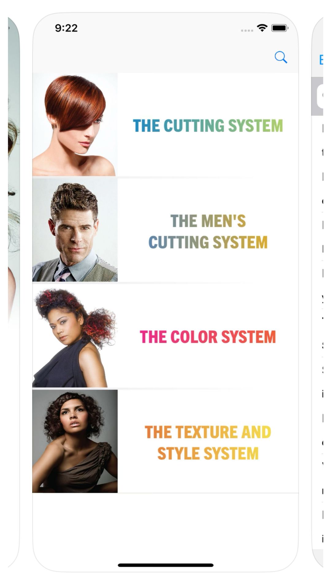
The system menu acted as the app’s central hub, connecting students to The Cutting System, The Men's Cutting System, The Color System, and The Style & Texture System. As the Lead UI Designer, I focused on creating a layout that simplified navigation while accommodating growth for future modules. Each system was visually represented with distinct but cohesive photography and color accents, allowing users to intuitively distinguish categories without straying from the Paul Mitchell brand’s playful sophistication. The dashboard balanced hierarchy and whitespace to make the experience approachable, even for users new to digital learning environments.
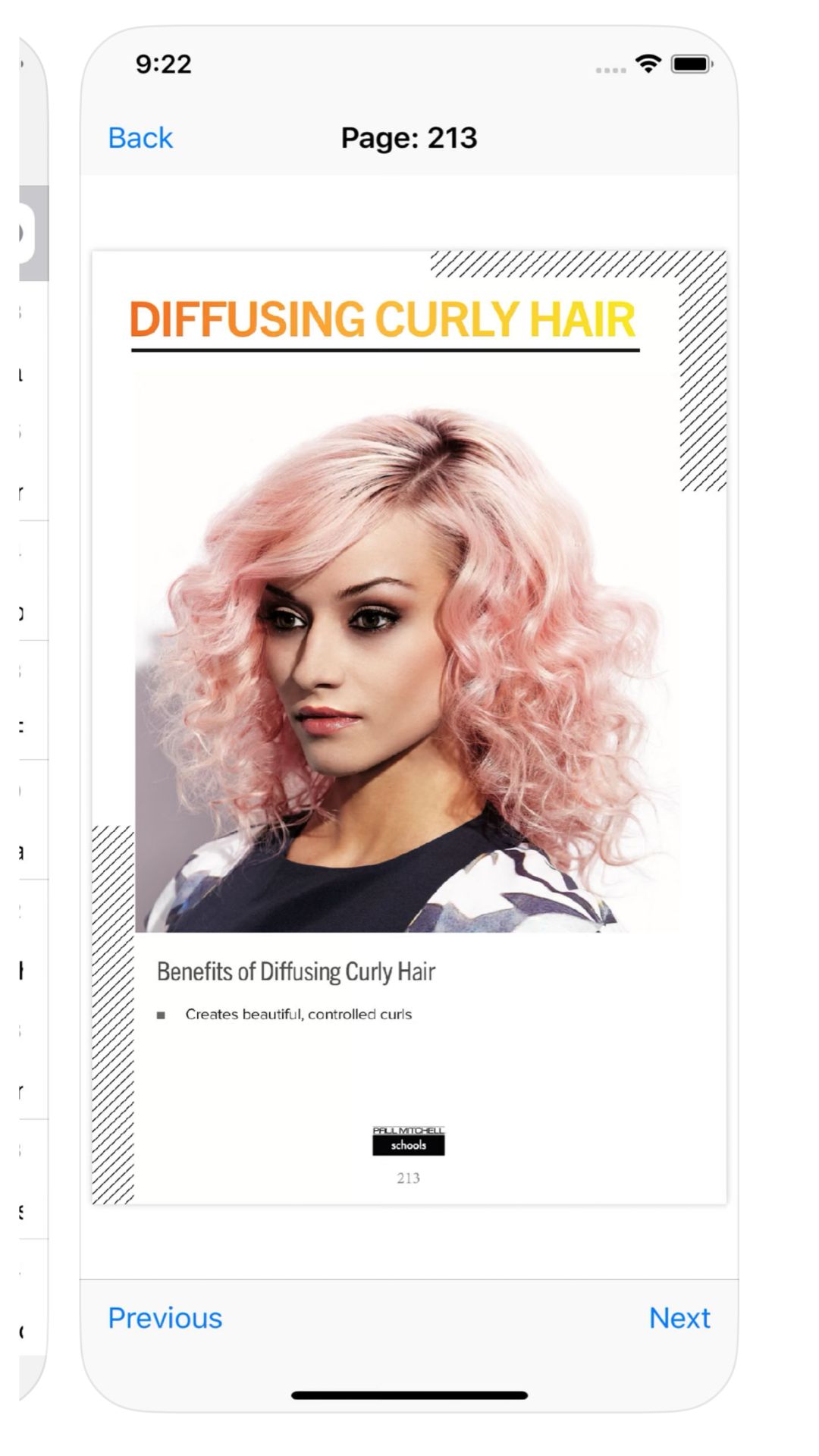
Interactive Flashcard System
The interactive flashcards transformed textbook memorization into an engaging digital study experience. Each card presented key technical concepts (such as color theory, cutting angles, and formulation ratios) using crisp typography and intuitive gestures like swiping and flipping. The design encouraged active learning through self-testing, while the responsive layout ensured seamless usability on iPads and phones alike. By integrating subtle animations and clean contrast, I created a sense of tactile realism that made studying both functional and enjoyable.
*Note some content has been wiped from the screens to protect JPMS proprietary information.

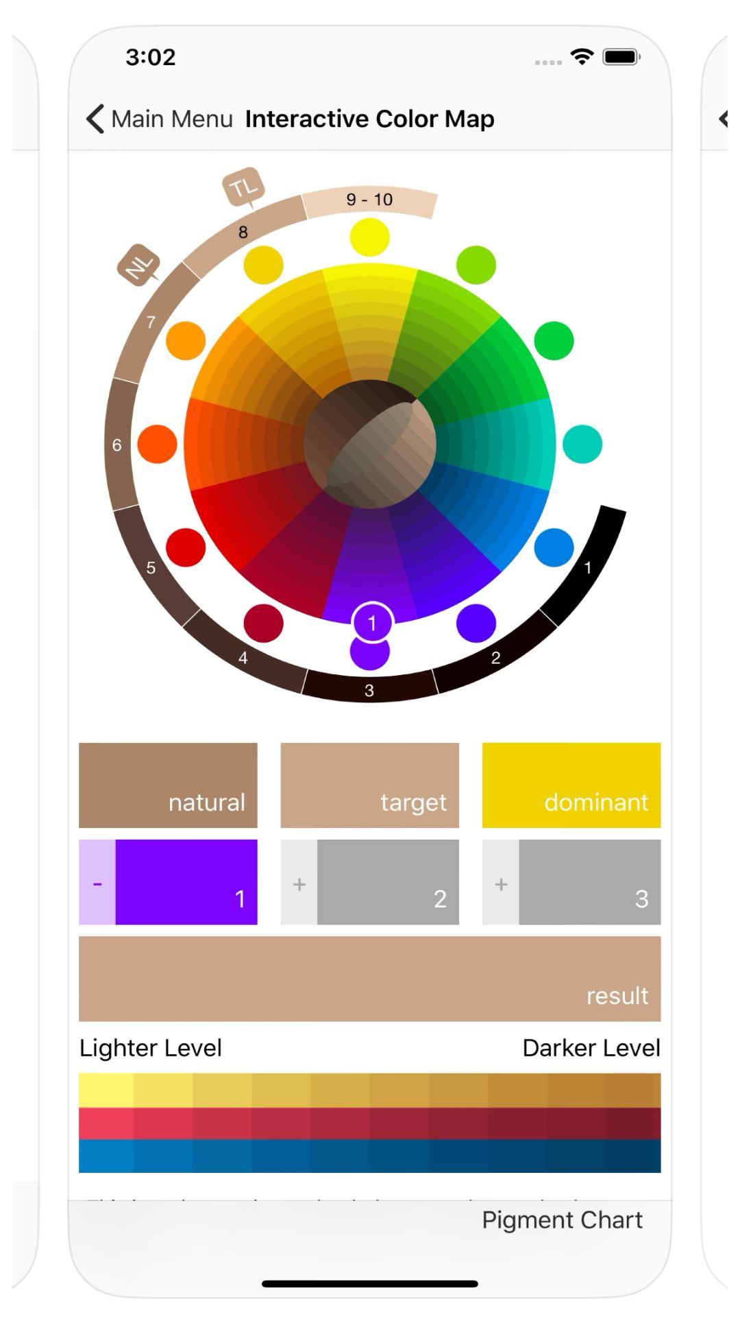
Color Map Interface
The interactive color map visualized the relationship between tone, depth, and placement in a hands on, intuitive way. I designed it to function as both a learning aid and a creative tool: users could experiment with blending formulas, overlay hues, and visualize real time color outcomes. The interface featured smooth gradients and clear labeling for chromatic harmony while ensuring ADA compliant contrast levels for clarity. This feature quickly became a standout among students for its balance of artistry and education by turning color theory into an immersive visual experience.
Video Dropdown Menu
This feature served as the gateway to the app’s rich library of HD tutorials filmed from a stylist’s perspective. I used a modular accordion structure to support scalability across hundreds of lessons while maintaining visual simplicity. Clear typography and hiearchy reinforced accessibility and learning continuity for a diverse student base.

Headsheet Diagram Tool
One of the most technically complex interfaces in the app, the headsheet diagram tool allowed students to digitally map haircut sections and techniques. I designed the layout to mirror traditional stylist diagrams but with enhanced interactivity. Users could draw, color, and label directly on a digital canvas. The tool supported zooming, layering, and sharing, effectively replacing the need for paper headsheets. This innovation modernized how Future Professionals practiced and documented their technique, bridging the gap between physical and digital learning.

Impact
Although Future Professionals is now a legacy product, it represented a major evolution in how Paul Mitchell Schools approached digital education. The unified experience improved:
- Student engagement across remote and in-class learning.
- Cross-system consistency through shared UI patterns.
- Speed of learning adoption, as evidenced by higher completion rates reported during pilot phases.
Paul Mitchell The School
2022 - 2024
Branding
Web Design
Marketing
Social Media
Photography

